Let's Jump Right In!
You should look at your website in the same light as you would the storefront of a traditional bricks-and-mortar business. For any business website, the homepage is analogous to a shopfront window, showcasing the most important and best-selling products and services that you have to offer, as well as any discounts and other promotions. Your website's effectiveness relies on its ability to draw people in, and you will need to put plenty of time into it in order to minimize your bounce rate and keep as many visitors as possible on your website long enough to convert them into leads or paying customers.
This guide takes a look at the process of evaluating the effectiveness of your website in nine easy steps so that you can better expose any issues which might be holding it back and tackle them accordingly. It should not be difficult or particularly time-consuming to make a preliminary evaluation of a typical business website, and one to three hours should be ample. Be sure to take plenty of notes throughout the process while following the steps below.
1 - What Draws Attention Most?
Try to put yourself in the position of a visitor. Navigate to your business's homepage and determine what grabs your attention before anything else. It is important to realize that attention spans tend to be very short when browsing the Internet, hence the fact that most people only take a few seconds to decide whether or not they want to stay on the website or start looking elsewhere.
These first one to five seconds count for a lot, so it is crucial that something about your homepage draws enough attention to inspire people to take the next step. If it takes more than a few seconds to focus on anything in particular, then your website probably has a confusing interface or design which doesn't guide your visitors forward. The first thing you notice about your homepage should be something which buys you more time.
2 - Is It Obvious What Your Website Is About?
While drawing enough attention to inspire people to stay on the page, you'll also need to get your message across. People should know what your website is about within the first few seconds, and if they are coming from the search engines, it is important that your website relates to the search queries which they entered. If it does not, your bounce rate will increase exponentially, and this is why it is essential to target relevant keywords in your search engine optimization (SEO) campaign.
As a business selling a particular product or service or attempting to gather more leads, you should make your purpose and mission clear from the very outset. When evaluating your homepage or landing pages, determine whether or not there are any distractions which detract from getting your message across.
Here is a site we did for an insurance brokerage that specializes in agricultural insurance. Is there any doubt about what they sell or who they target?
3 - Is the Most Important Information Easily Accessible?
Visitors should never have to scroll down to reach the most important information on a webpage. As a business trying to make sales or generate leads, you will need to have a clearly defined proposition which your visitors will notice almost as soon as they land on your website. Your selling proposition should be short and to-the-point, ideally consisting of a single sentence which draws people in and guides them towards taking further action.
It is also important to take mobile users into account. Using smaller screens, mobile users will typically have to scroll more than desktop users. However, they too should not have to scroll down the page to find the most important information. Keep your page headers narrow enough, and ensure that everything important is located within the first couple of hundred vertical pixels.
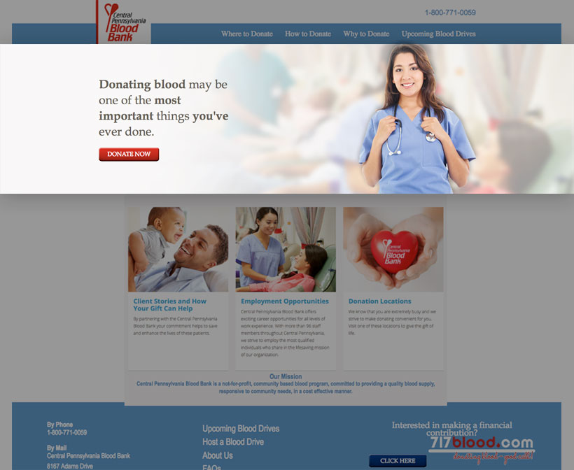
Is the call to action clear on this site? If you wanted to donate blood, would you have trouble figuring out how?
4 - Are the Benefits of Your Product or Service Easily Visible?
People use the Internet every day to seek help, entertainment or knowledge. When marketing your business online, your job is to show your website visitors how your product, service or company as a whole can benefit their lives in some way. While listing features is also important, listing benefits is even more so. Again, a brief list of some of the key benefits which you have to offer should be above the fold so that people never have to scroll down to see them.
When evaluating any page which has the purpose of selling something or generating leads, make sure that the benefits are clearly highlighted and as obvious as possible. If they are interested enough by the benefits that you list, then they will likely want to view a more detailed list of features as well.
5 - Does Your Call to Action Stand Out?
One more element which needs to stay close to the top of the page and be clearly visible is your call to action. Even if your content is great, a lot of people will still lose patience if it is not immediately obvious what to do next. Guide your visitors towards fulfilling your intended goals by using a clearly defined call to action accompanying the benefits that you list. However, keep your calls to action to a minimum so that you don't risk confusing your visitors.
A call to action may be something as simple as 'buy now,' 'subscribe now' or 'download a free trial'. Your calls to action should be short and to-the-point, using an imperative verb and avoiding passive voice or any unnecessary additional fluff. It should also be clearly visible by way of carefully chosen typography and colours.
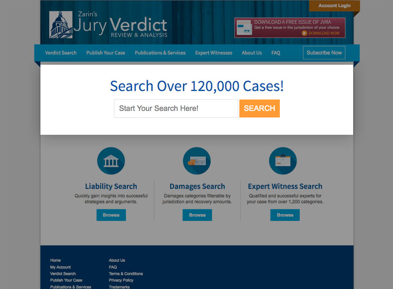
This is a legal publisher's site whose visitors are lawyers looking for information on court cases. We made the site as easy to use as...Google...
6 - Is Your Website Aesthetically Pleasing?
Whether your website is aesthetically pleasing is entirely a matter of personal opinion, but there are many important practices which you should use to make your website as appealing as possible to the public in general. While you might prefer more vivid and unusual styles and color schemes yourself, others might not. It is important that your website's look and feel suits your industry and the typical tastes of the demographic you are trying to target.
If you're really not sure what's suitable in terms of aesthetic design, try taking a look at some of your more successful competitors' websites to see what they are doing. With most industries, deviating too much from the mainstream will cause you to lose visitors. Take time to choose your color schemes carefully and ensure that graphical content is high in quality.
7 - Is Your Content Easy to Read?
Typography is a very important element of modern Web design, not least because designers are no longer restricted to a very small selection of Web-safe fonts. However, it is also easy to go overboard with the usage of different fonts, and this may lead to your website not being aesthetically pleasing, or worse still, difficult to read. Your written and visual content are what matters, with the way in which you present it being of secondary importance. Choose fonts which are easy to read, and be wary of extravagant script-like fonts as well as those which make heavy use of serifs. For the bulk of your written content in particular, it is generally good practice to stick to a plain sans-serif font and plain black on white text. Trying to deviate too much will alienate many of your visitors.
8 - Is Your Content Web-Friendly?
Creating content for the Web is typically quite different than creating it for printed media such as magazines, and this is largely due to the shorter attention spans which people usually have when browsing the Web. Ensure that your content is easily scannable by using:
- short paragraphs,
- subheadings,
- and bulleted lists where appropriate.
Remember that every sentence should have the goal of inspiring the reader to continue reading. You should also determine whether or not you have adapted a style which is suitable for your business. For example, in business-to-business marketing, a more corporate and professional style is generally preferred, while in business-to-consumer marketing, a more conversational style will help you to win reader engagement.
9 - Is Navigation Straightforward?
Your website's navigation is something which you should evaluate not only on your desktop or laptop computer - you should also thoroughly test it out on the smaller screen as well. Ensure that your visitors' experience is not hindered in any way on any type of web-enabled device by poor navigation.
Not only should your navigational features be clear and easy to follow - they should also be consistent throughout your site, otherwise you end up confusing your visitors. Adding unnecessary navigational features will also clutter your website and distract people, so keep them to a minimum wherever possible. Simple navigation is particularly important on landing pages where you should ideally only have one button or link which also doubles as your call to action.


